

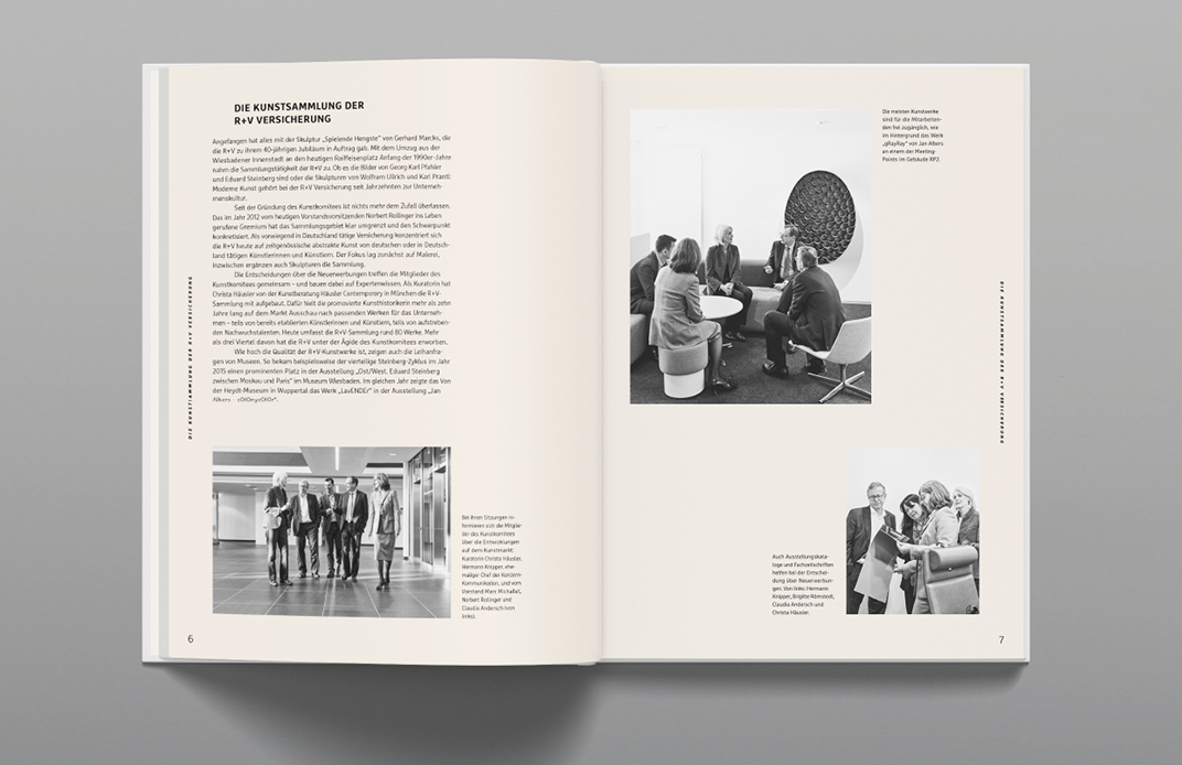
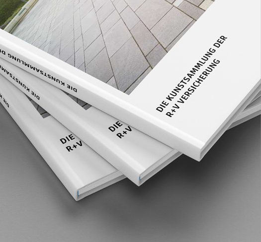
R+V Art Book:
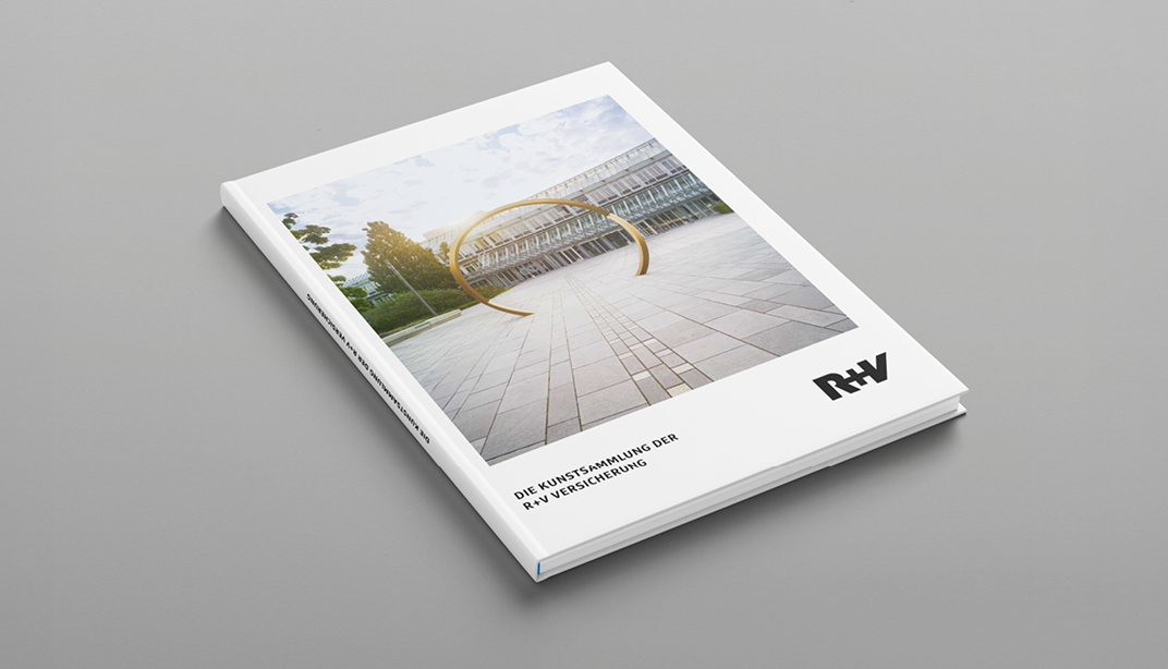
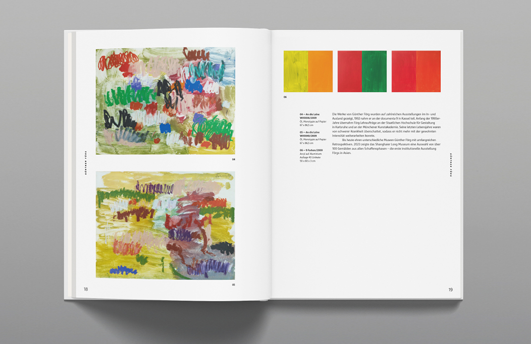
The R+V Versicherung art collection has been continuously built over the years – initiated by an internal committee with the goal of consciously designing work environments. The collection demonstrates how art shapes workspaces, facilitates encounters, and opens up new perspectives. The focus is on contemporary abstract art by artists who live and work in Germany – with a particular emphasis on painting and sculpture. Since the founding of the art committee in 2012, the collection has been systematically expanded. The works are present in meeting rooms, hallways, and on Raiffeisenplatz. Heisters & Partner was commissioned to create a book that documents the collection in its entirety for the first time – as a snapshot of a vibrant inventory that continues to grow.
Book Design
The R+V art collection demonstrates how art can specifically contribute to strengthening corporate culture. It opens up new perspectives, supports a shift in perspective, and thus promotes resilience in everyday working life. This makes art an active component of corporate change.
The book invites you not only to observe the works of art, but also to consciously perceive their effect on spaces, communication, and individual perspectives – and thus to recognize the value of art as a source of inspiration in the work environment.
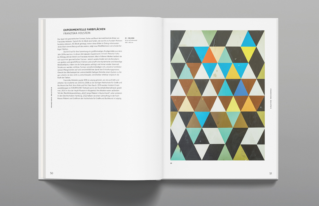
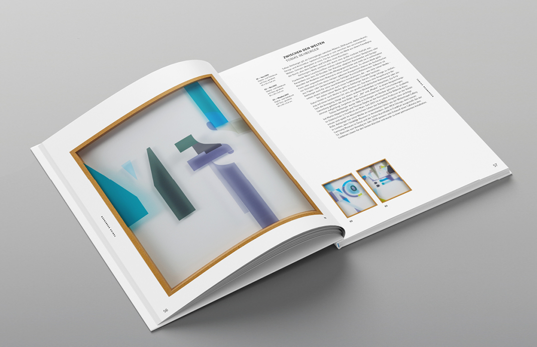
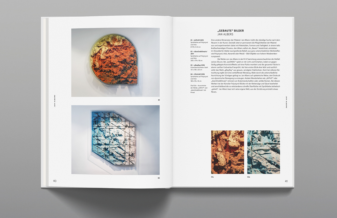
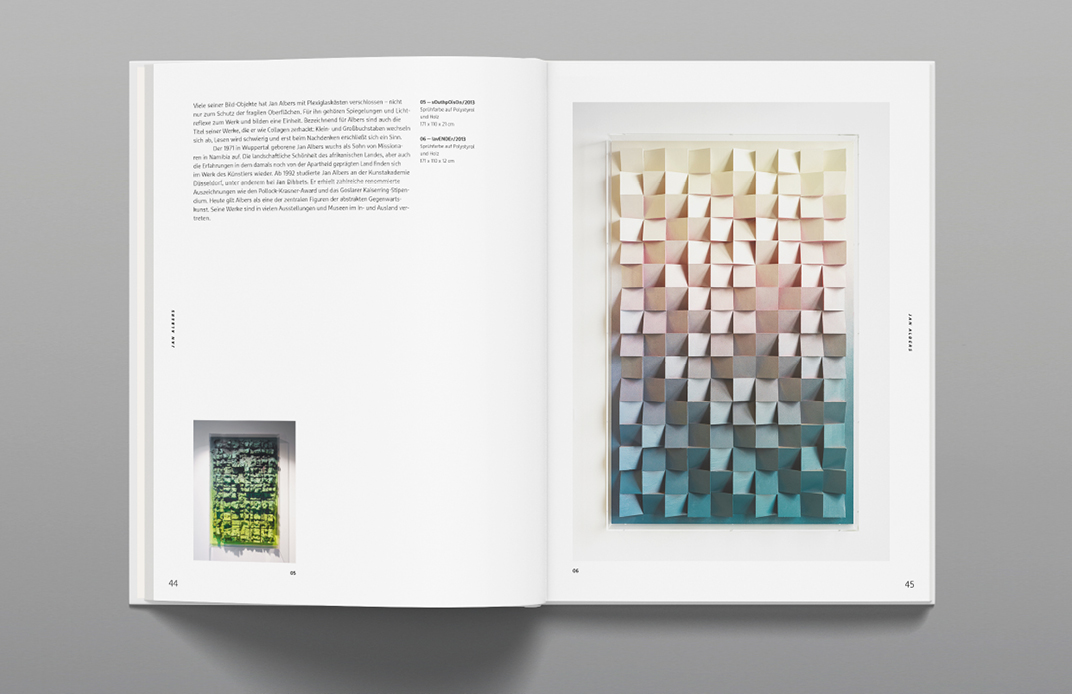
The book's design is deliberately minimalist and clearly structured. Generous white space and a clear hierarchy ensure that the artwork remains the focus without distraction from superfluous design elements. This creates a clear and calm visual environment.
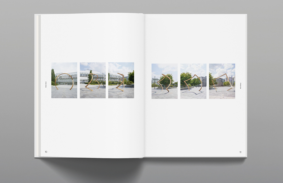
The artworks are systematically presented in a modular, flexible grid that responds to different content through recurring but variably arranged units. This grid creates a clear structure and is brought to life through varied sequences, creating tension in the layout.
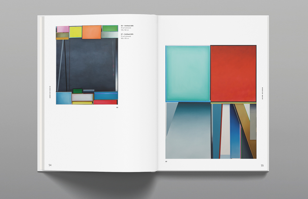
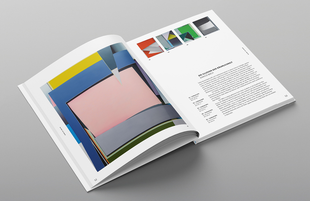
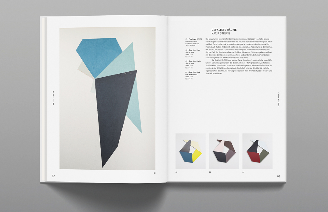
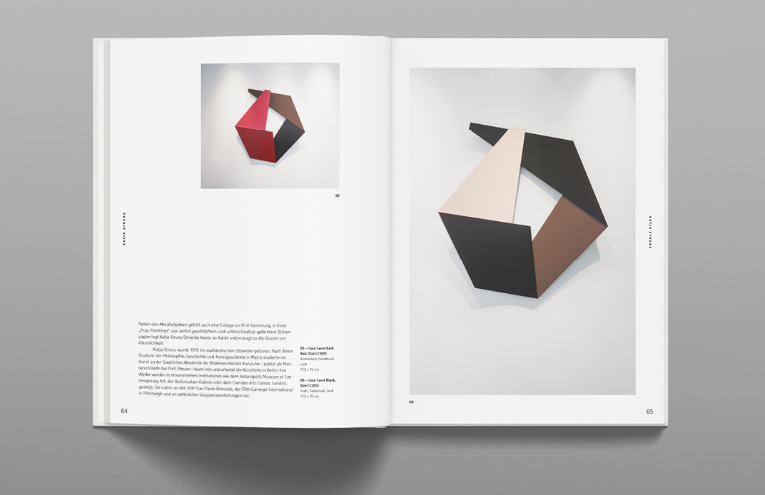
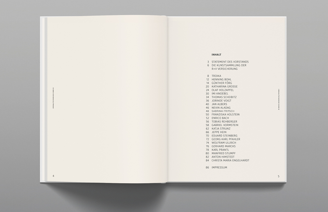
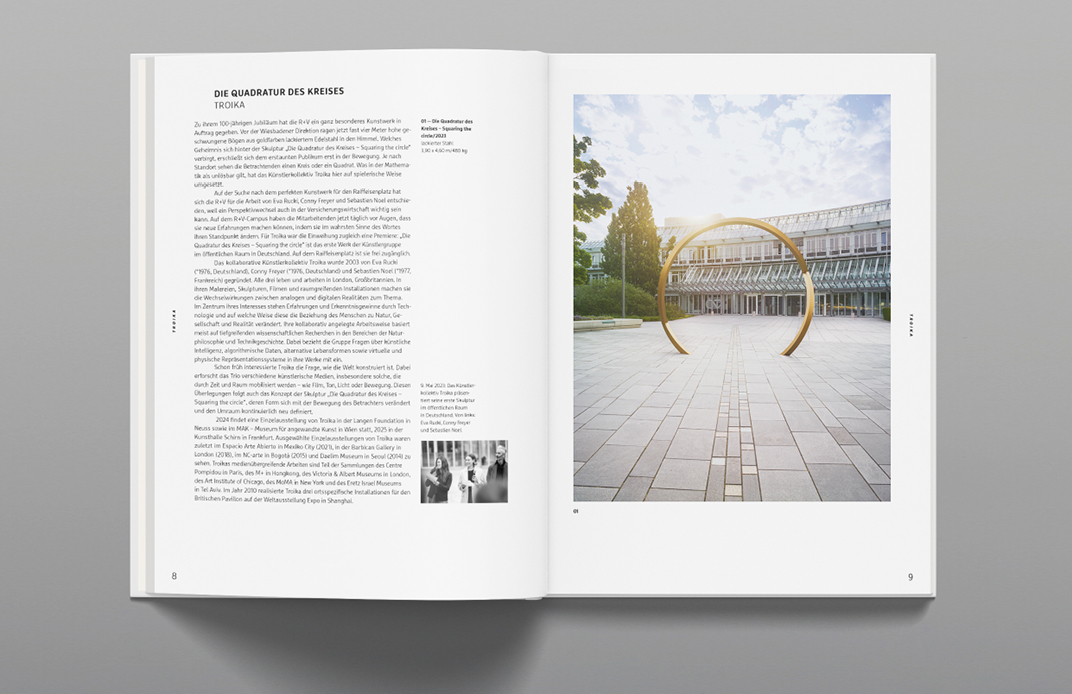
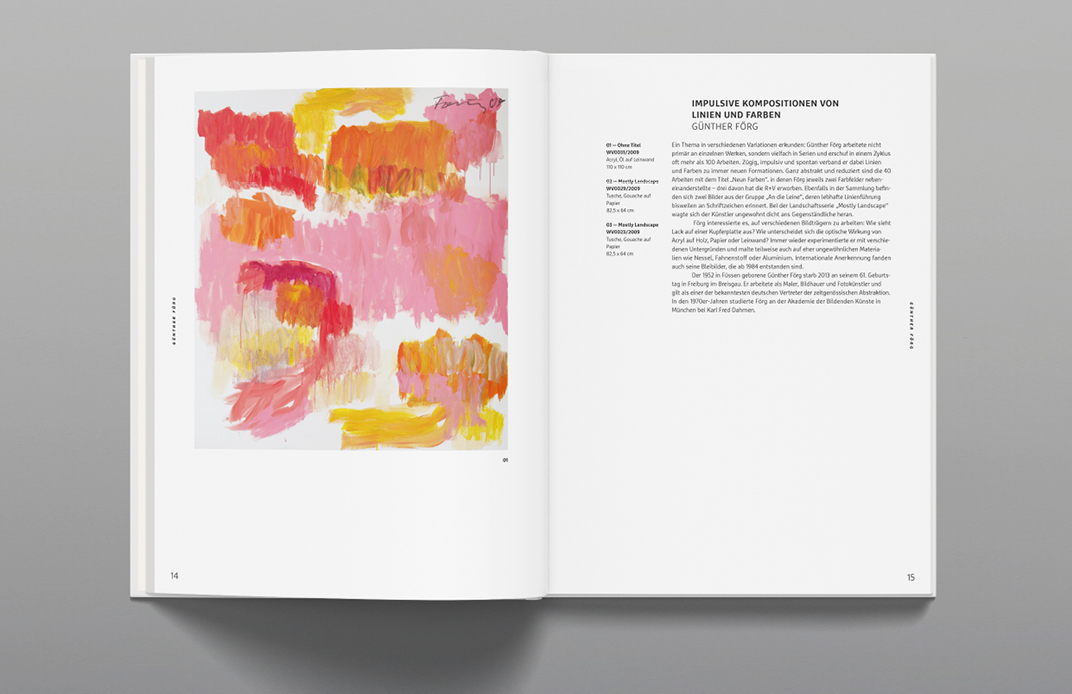
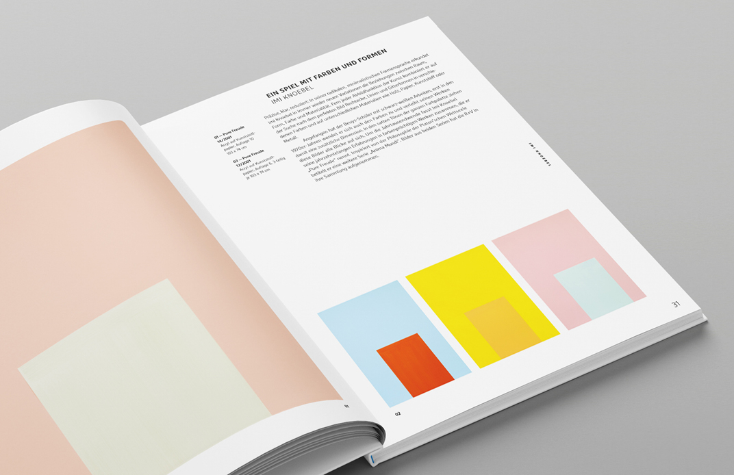
Instead of traditional chapters, the structure is centered around the individual artists. The works are presented across double-page spreads, creating a coherent visual narrative that flows organically throughout the book.
R+V's corporate typeface is »Marselis for RuV.« The typeface family combines geometric precision with humanistic elements and offers great typographic flexibility in its various weights. This diversity allows for clear differentiation between different text levels and ensures a varied typeface.
 Top
Top