

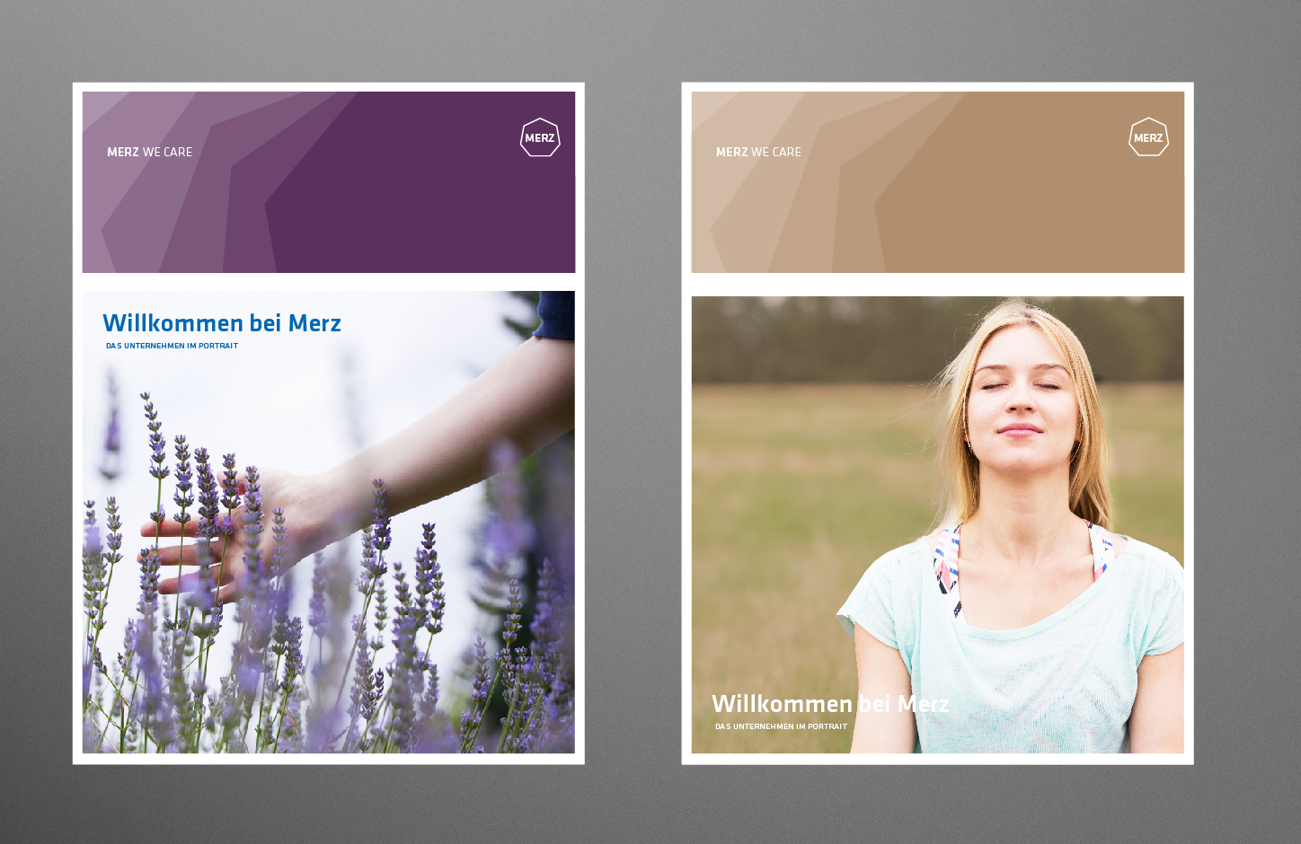
Merz – We care.
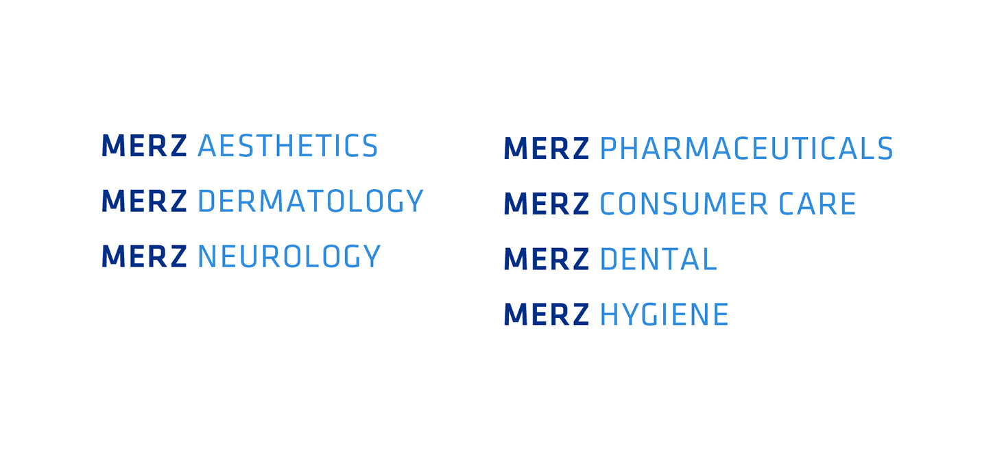
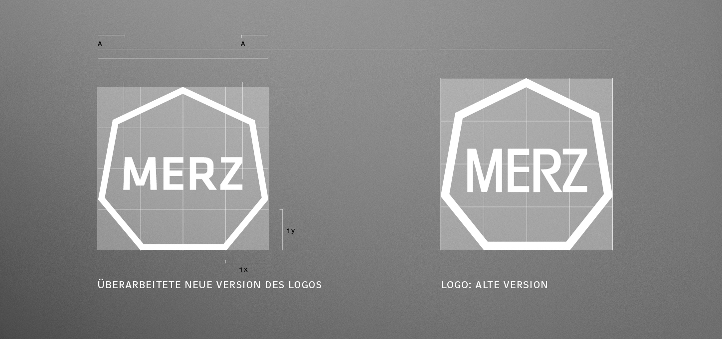
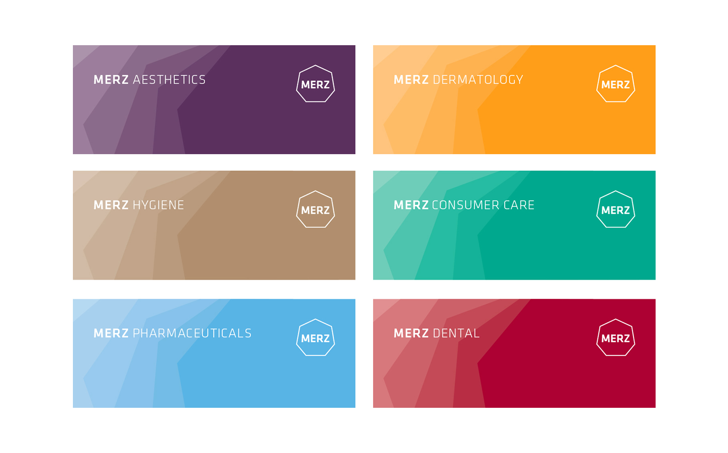
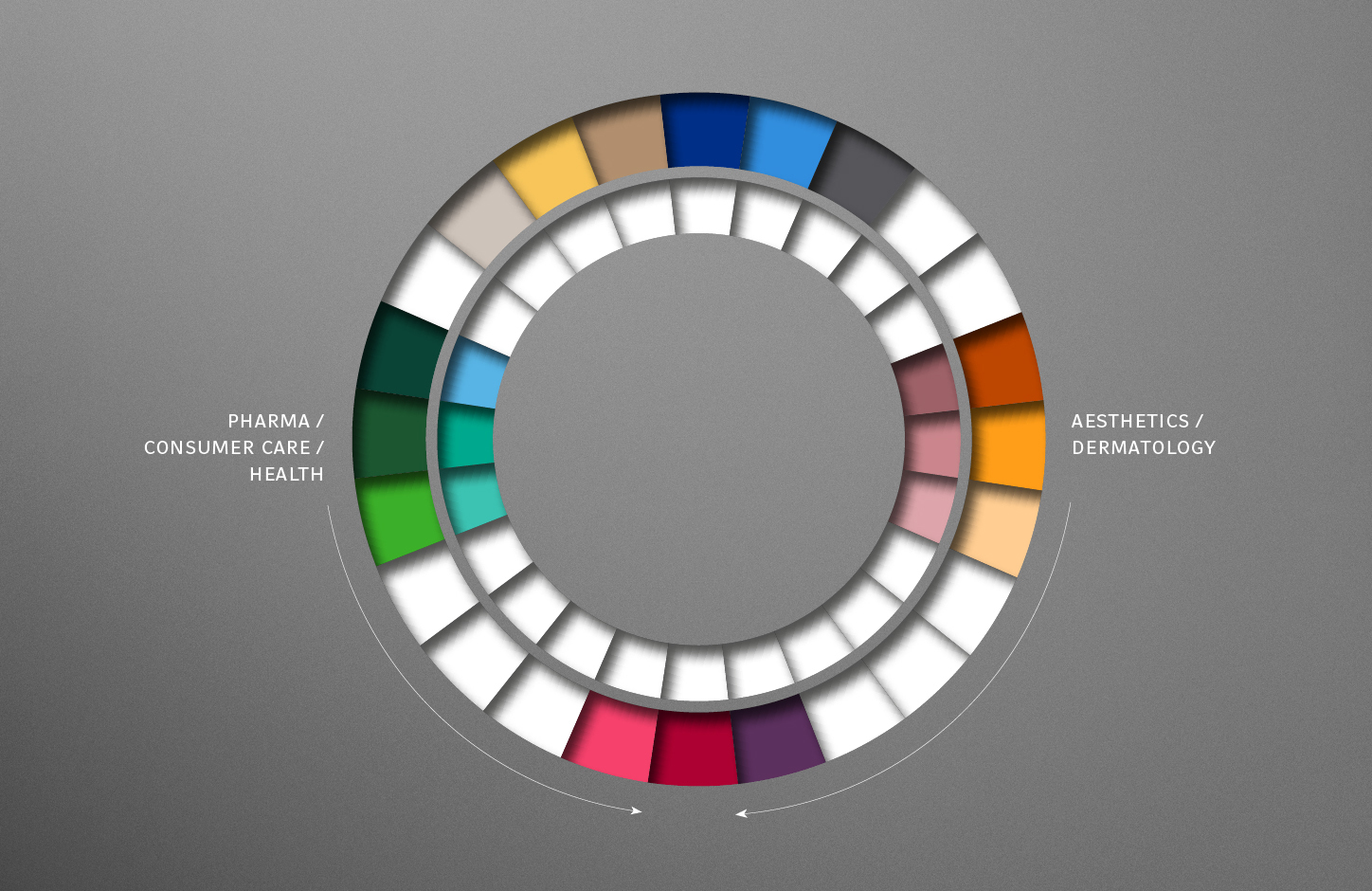
Heisters & Partner developed a redesign on behalf of the pharmaceutical company Merz with the aim of revitalizing the entire brand image. The existing logo and the associated corporate design were basically from the 1970s. The focus of our design was to align the design parameters with the changing identity of the more than 100-year-old company. We concentrated primarily on the typography, colors and shapes, without calling the basic identity into question. This was done not least to ensure that the Merz brand continued to be highly recognizable among specific target groups. On the other hand, the dynamic change of the company and the associated strong internationalization through major acquisitions and relocations of business areas should be reflected in the new appearance and, last but not least, the »Pharma Aesthetics« aspect should be put into a relevant relationship with the younger target groups of these products.
Corporate Identity
In this identity development process, our design team not only looked ahead, but also closely examined the origins of the over 100-year-old family business. The time of the company's founding and the intentions of the founder Friedrich Merz played an important role in the design development, because change and transformation have always been important characteristics of the global player and are deeply embedded in the company's DNA.
Corporate Design
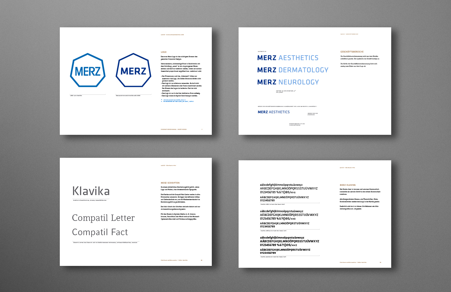
We decided on »Klavika« as our new corporate font, which, in addition to constructive-industrial features, also has formal aspects of Art Nouveau and the Anthroposophical Movement of the 1910s and 20s and, overall, has a humanistic and natural expression: a fitting expression in times of increasing fractalization and concentration of the individual on his or her immediate surroundings. How can an aspect such as »pharmaceutical aesthetics« and »individuality« be put into a relationship that is relevant for the target groups when the aim is not to establish a generally valid ideal of beauty, but rather to develop and preserve the beauty of the individual?
The process led us to values such as »naturalness«, »individuality« and »protection« in the sense of conservative preservation. We therefore had to meet the needs of the target groups to »preserve and protect« their natural, deeply individual beauty. It was exciting to relate the founding period, the Art Nouveau era, to the present day and its understanding of youth and beauty, and at the same time it was astonishing what parallel values could be derived here in order to formulate an answer to the area of tension between the general and individual concept of beauty. According to this model, aesthetic aids always serve a perceived naturalness, which ultimately constitutes beauty.
Publications
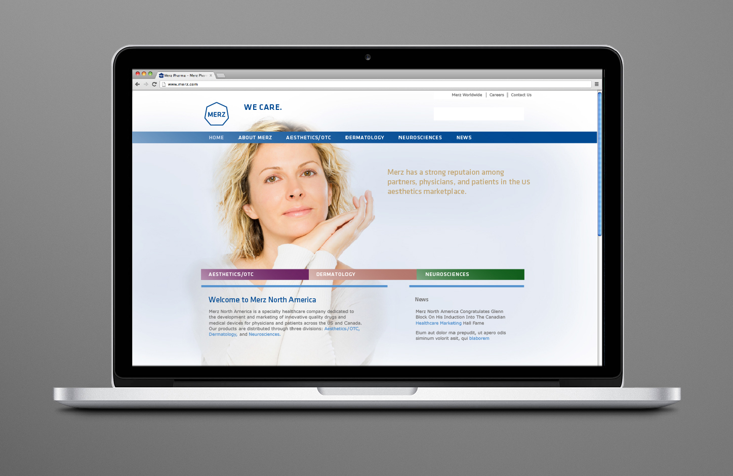
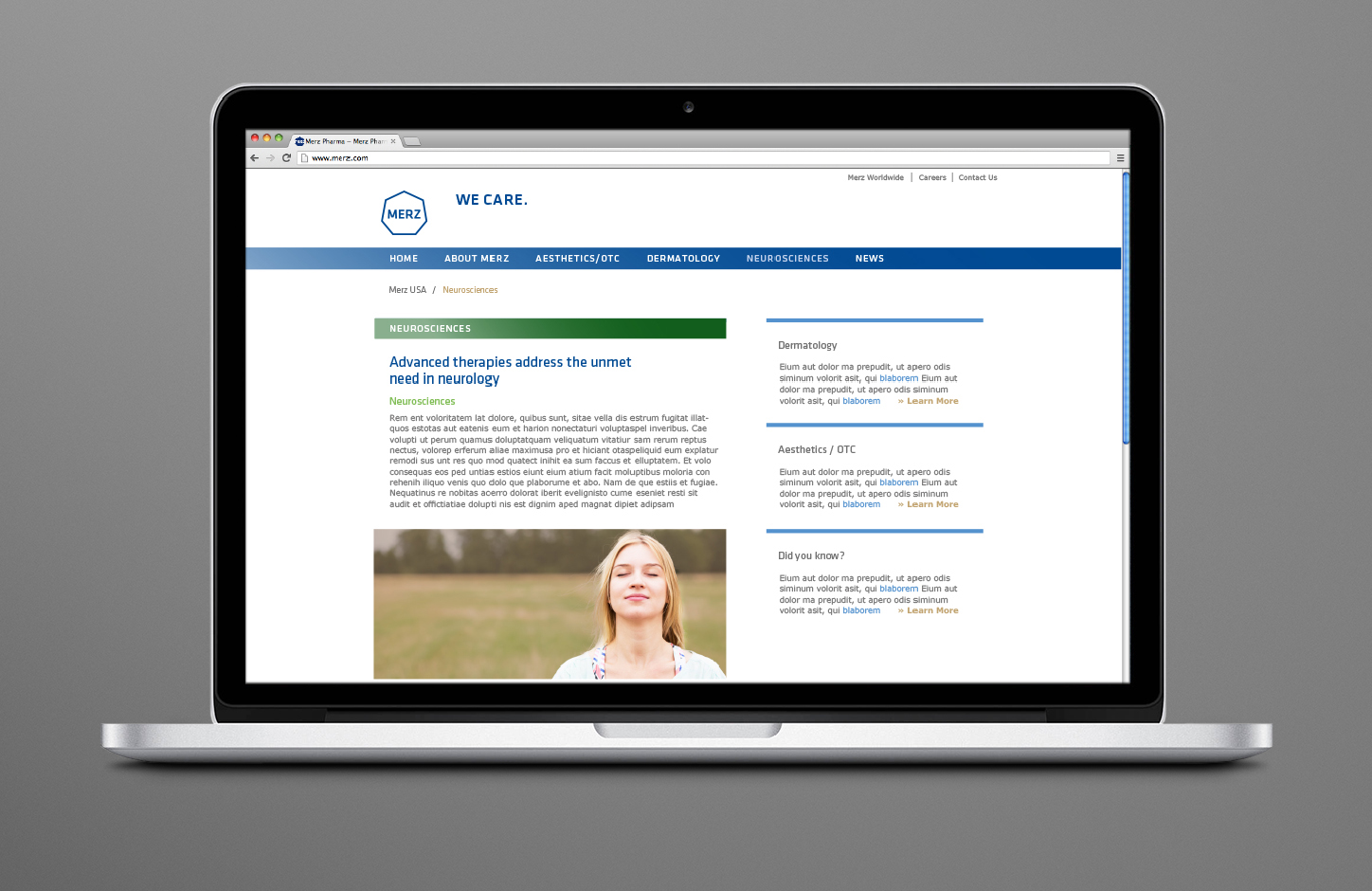
Merz Online
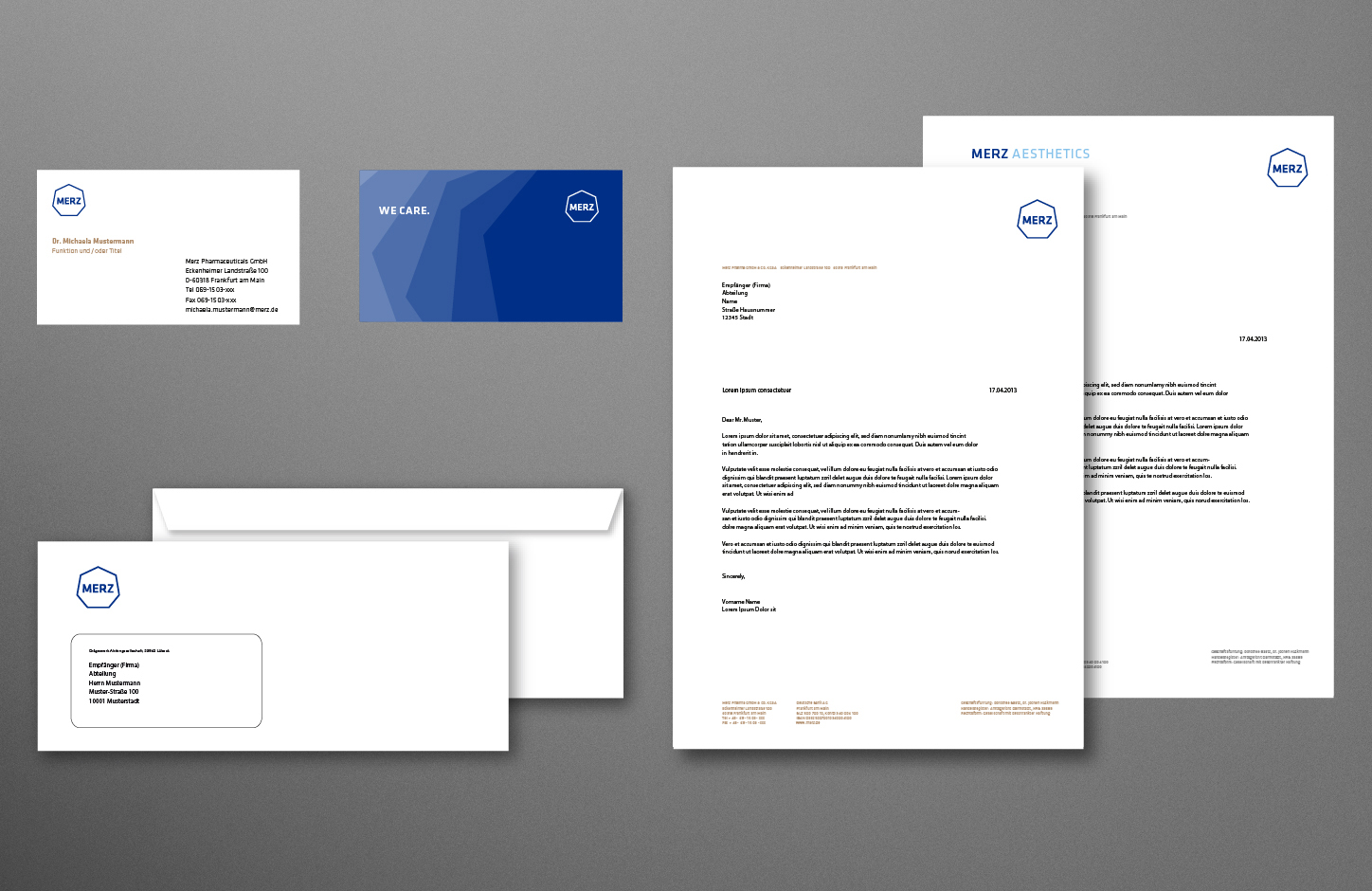
Design hypotheses were developed in several scenarios and then coordinated and synthesized in close consultation with those responsible for communications and with representatives of the Merz family. The company bought the entire study and its usage rights without ultimately implementing them. Instead, Heisters & Partner was commissioned with a milder relaunch of the overall appearance, incorporating important aspects of the developed mission statements and culminating in all relevant channels and a whole series of manuals. In this relaunch, the aspect of internationalization was given greater consideration, without ruling out the possibility that the company will follow the more open design modules in the next steps.
 Top
Top