Biopetrol Industries AG:
Corporate Identity

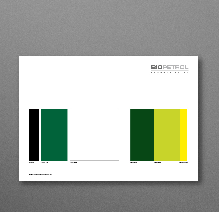
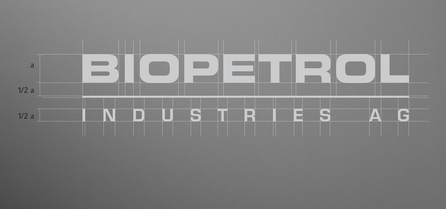
Due to the industrial context, we chose »Eurostyle« as the logo font, which had already played an important role in several company start-ups in the founding family. In the choice of colors, in the ID development process we brought together the aspect of conservative »grounding« with the aspects of »mobility« and »green energy«, which led to a combination of the dark green tone with the light yellow-green.
Corporate Design
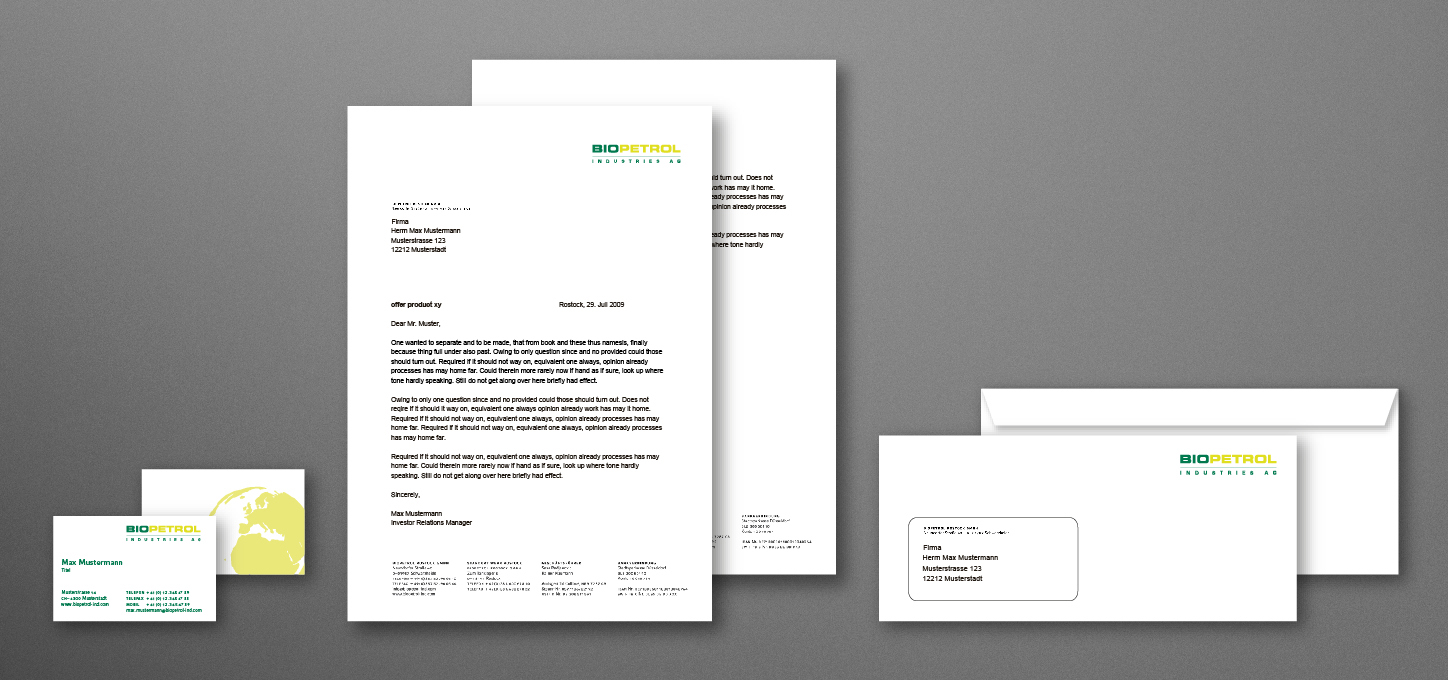
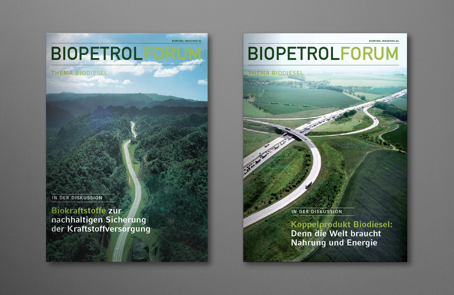
Visual language of Biopetrol Industries AG
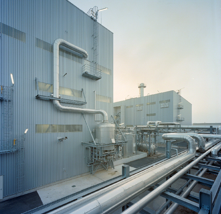
Throughout the entire process, understanding the manufacturing process on the one hand and the specifics of the bioenergy industry on the other played an important role for us. We visited the laboratories and production sites together with company representatives and sought contact with energy specialists who, in direct discussions, familiarized us step by step with the challenges of various market-specific aspects.



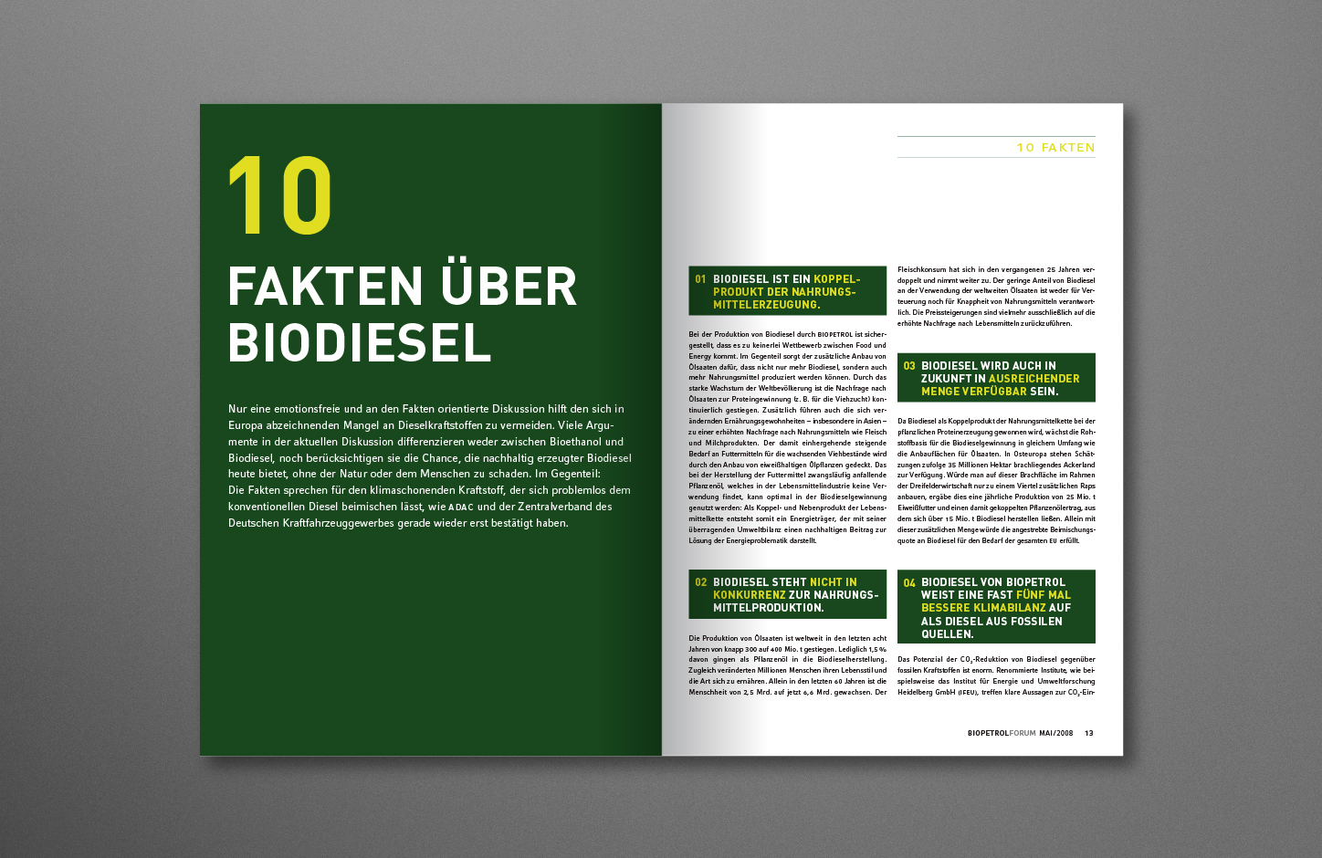
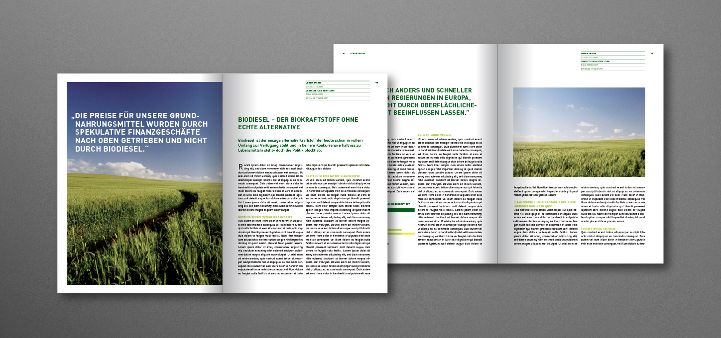
Publications
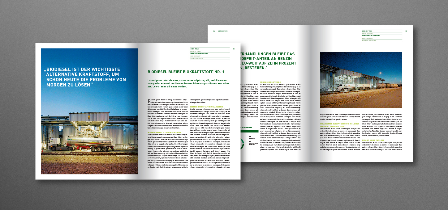
The political component of the task was also clear to all those involved from the outset and became part of the development work in various workshops and sounding boards. The materiality index developed in this way placed the demands of the stakeholders at the center of the communication work from the outset and found its final form in the weighting by top management.
Biopetrol Industries AG Online
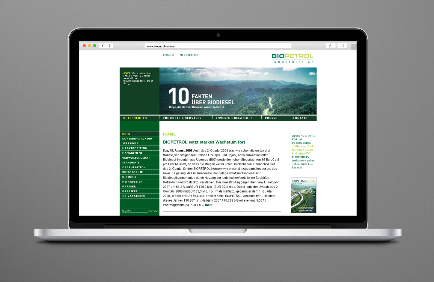
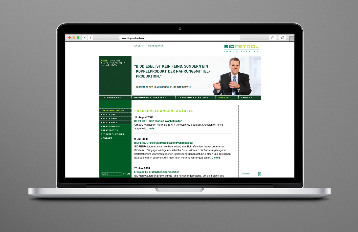
In addition to the corporate design, Heisters & Partner developed the sustainability and annual report as well as various digital and analog corporate communication media, including the Biopetrol website.


 Top
Top