

ACG AG:
ACG AG develops and sells components and systems for chip cards (»smartcards«) and also offers its customers complex semiconductor products. As part of a broad pitch, Heisters & Partner developed ACG AG's annual report and was subsequently commissioned to relaunch the company's image. Heisters & Partner initially developed several scenarios based on a previously conducted study that had defined and evaluated the company's identity, the market situation and the appearance of competitors. In dialogue, the hypothetical proposals were synthesized step by step and transferred to various media as examples.
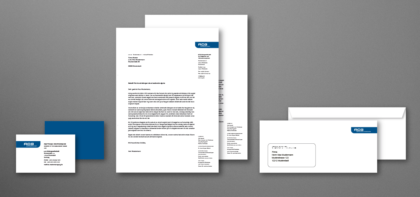
Corporate Identity
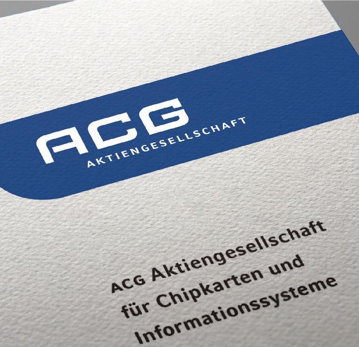
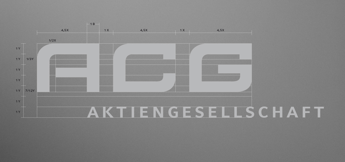
The logo was developed from a font specially designed for ACG AG and combines soft, round shapes with rectangular ones in its capital letters and, in addition to the association of organic growth in a technological context, also takes up the design language of classic smart and SIM cards. The continuous basic shape underlines the digital character of the company and solves the problem of the inhomogeneous shapes that arise when »ACG« is written in capital letters. The letters of the word mark constructed in this way now arise from a continuous basic grid and, placed on a dark blue auxiliary form, finally form the company logo. Olaf Leu, one of the world's most renowned type and graphic designers, was involved as a senior consultant in the overall development of the technology company's logo and typeface. In collaboration with our team, Linotype and Leu developed the internationally award-winning »Compatil« typeface system in parallel and used it for the first time as a pilot project in ACG's corporate design.
Corporate Design
Publications
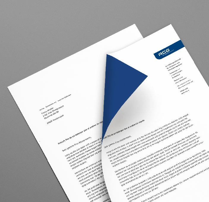
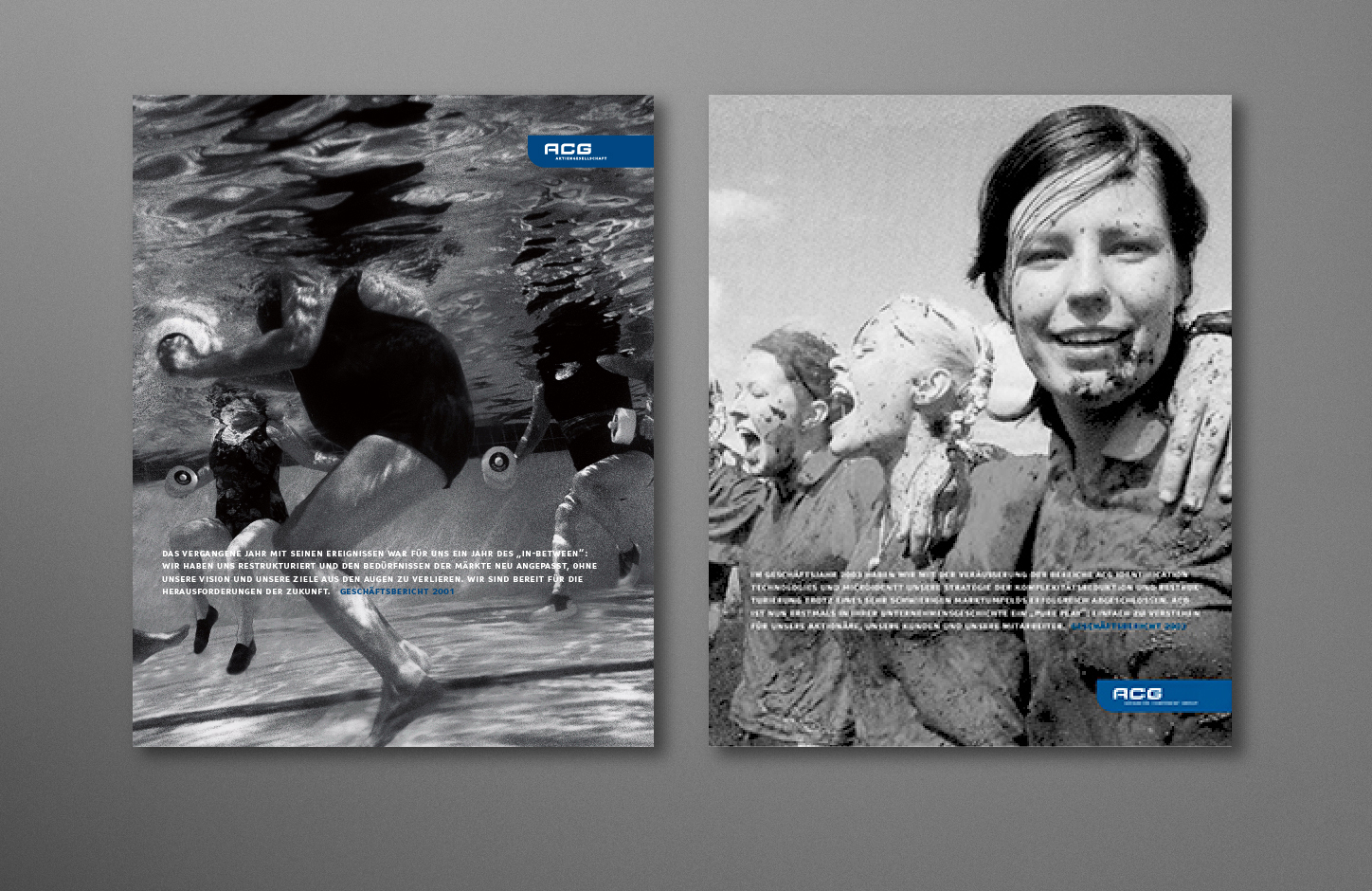
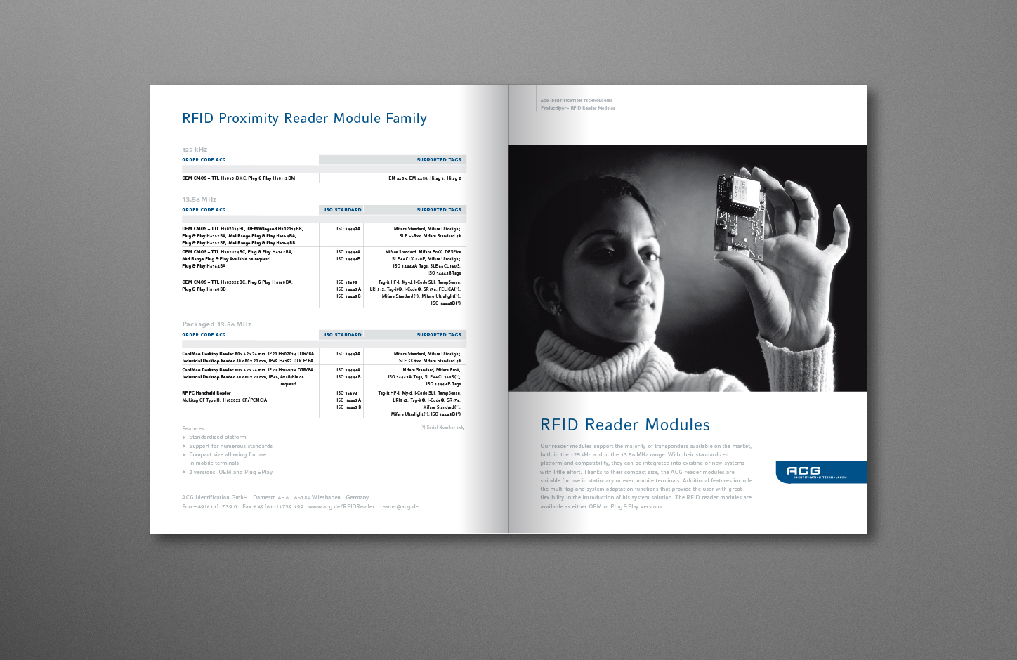
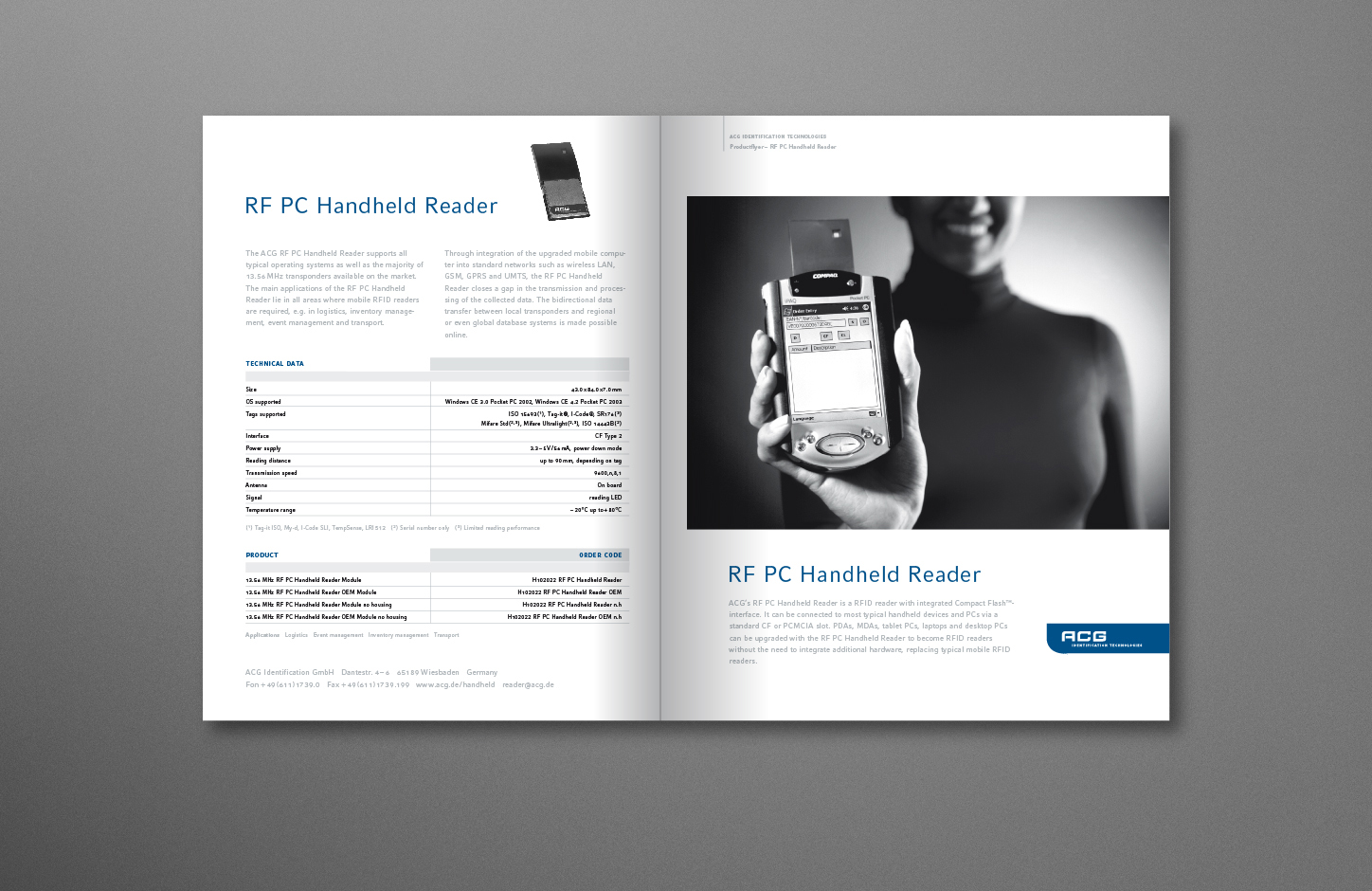
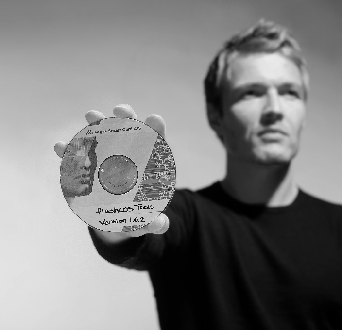
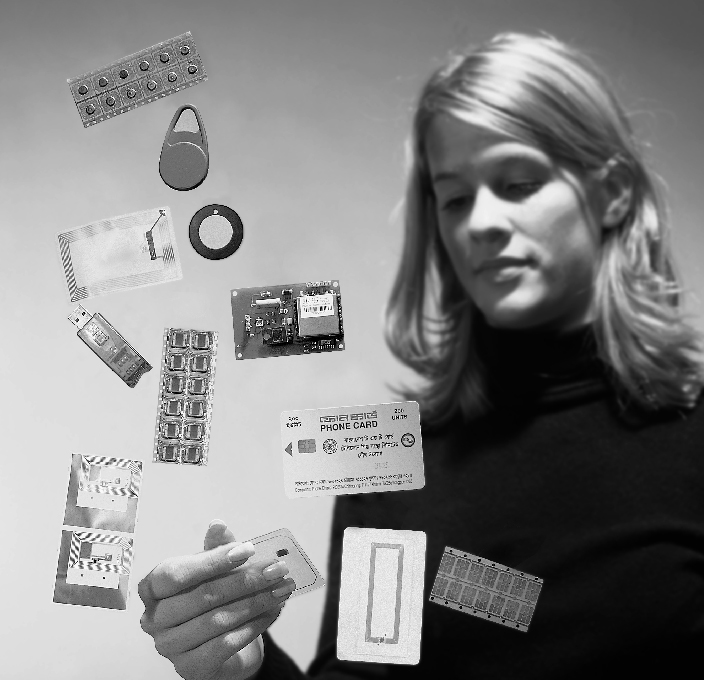
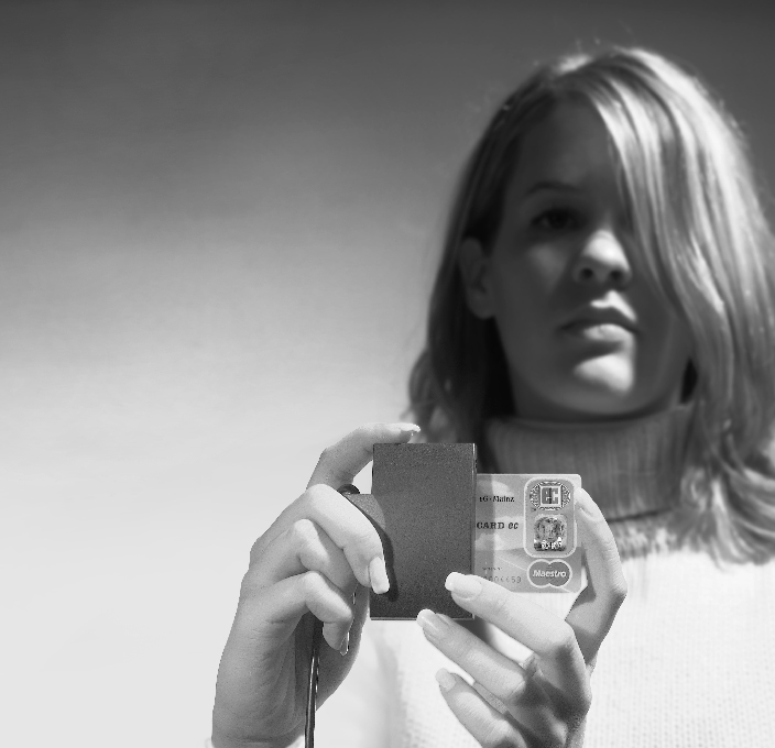
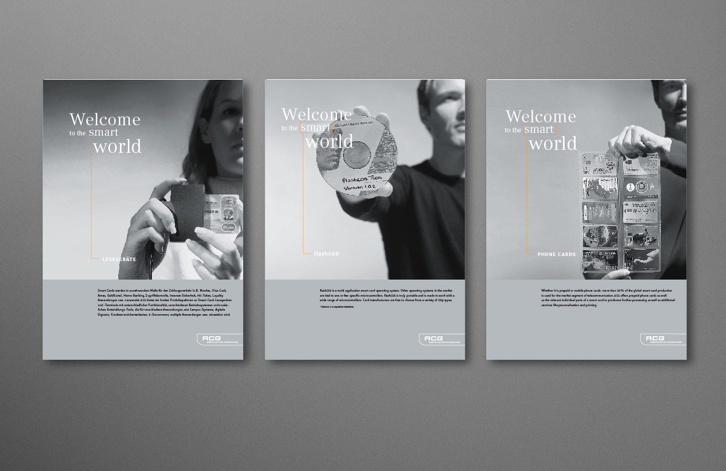
In addition to typography, imagery also plays an important role in ACG's corporate identity. The corporate image is kept entirely in black and white and its content is always authentic and independent. These specifications include not only image images, but also technical photos and all product photography. The conscious decision not to use color images creates an independent corporate design that is highly recognizable. In addition to the annual report, Heisters & Partner developed various corporate communication modules. Other tasks to be solved included the media of sales literature and technical documentation. Here, our team developed target group-specific digital applications and various microsites.
Corporate Image

Advertisements
 Top
Top